|
Home > Help
files >>
Creating a navigation image
Creating a navigation image
We strive to provide information that will be useful
in building your site from our templates. One of the
questions we've been asked is "How do you do what
you do?" This tutorial will assist you in making
the rollover images from the blank gif files received
in the template package, so that the text has perfect
placement. The screenshots were taken in Photoshop but
the instructions are very similar for all Paint Shop
Pro and Fireworks. If there are significant differences
for a particular program, they will be noted.
Photoshop
Paint Shop Pro
Fireworks
 Opening Both Blank Images
Open both the blank images. The easiest way is to Control-Click
to select both at the same time.
**Fireworks: The fastest way is to import
multiple images. File> Open Multiple> select an
image> Add. Continue to select images and Add for
each image you will need. Click Done.
|
Example One

|
Example Two

|
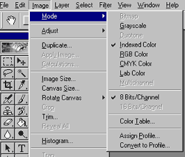
Go to Image>Mode and make sure RGB is checked. It
is quite likely the image will open as "Indexed",
so just click on RGB.
**Paint Shop Pro: Go to Colors>Increase
Color Depth>16 Million
 Merging Two Images into One Merging Two Images into One
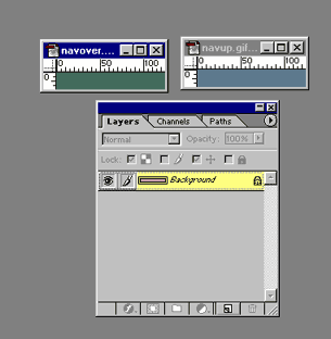
Now that both images are open, we will need to merge
them into one image to work with them. In Photoshop,
you can hold your mouse over the layer until it highlights
and then drag the layer to the second image. Note:
in the screenshot below, we are dragging the green image
to the blue.
**Paint Shop Pro: You may use the
Layers Palette and drag the layer to the second
image
also.
**Fireworks: In Fireworks before combining
the images, you will need to create the layers for them
in the layers palette. There is a New/Duplicate layer
icon at the bottom of the palette, or you may click
the little arrow at the top of the palette to display
a menu of options.
Click on the eye next to Layer 1 and the image
should no longer be visible. Click on Layer 2 and
drag the
second image into the document.
You may double click on the layer in the Layers palette
to give the layer a unique name.
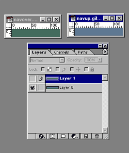
Now you should have one image with two layers. The
screenshot below shows the blue image on the right having
two layers, as seen in the layers palette.. You may
now close the first image without any need to save it.
 Adding Text Adding Text
The next step is to begin adding text layers. Carefully following the below steps will allow you to have text that is placed consistently when you are ready to save each individual image.
Click on the Text Tool on the toolbar. On the options bar, choose the font face you want, and set the color, size and alignment.

Click on the image to type your text. Photoshop will
add the text as a new layer. It is a good idea to start
with the text that will be the longest in your navigation
bar. If it isn't quite the right size you can easily
make those adjustments now, as well as the alignment
on the image. Once you have this one text layer all
set, you will be ready to make the additional text layers.
**Paint Shop Pro: Make your new layer
first by going to Layers>New Vector Layer. You will
be able to give the layer a name at this time, and using
the text that will appear on that layer is a logical
name. Click on the text editor icon, then click on the
image document. The text editor will open. Type the
word(s) you want on your button, adjust font, size,
color, kerning. Click OK to close the text editor.
**Fireworks: Make a layer for a button name
and label the layer to match the text that will
appear.
Add text in the same manner as Paint Shop Pro.
 Additional Text Layers Additional Text Layers
To make additional text layers, you will go to Layers>Duplicate. Or you may right click on the first text layer and choose duplicate. At this point PhotoShop will name the layer as a copy. For organization, it would probably be a good idea to right click on the new layer, choose properites, and name it according to what the new text will be.
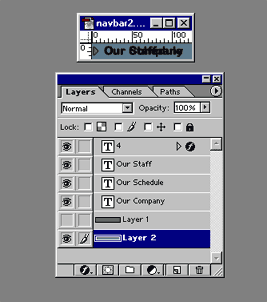
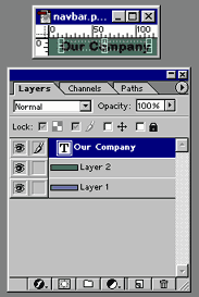
As you can see in the screenshot above, the actual
image above the layers palette looks a little jumbled.
This is because all the text layers are showing at one
time, with only the green layer hidden. You may find
it easier to work with some of the text layers hidden.
For our example, we've also added a text layer with
a Webding being used to display an arrow, which on our
layers palette shows as the number 4.
 Saving the Images Saving the Images
Now that the text layers are all made, it is only a matter of showing and hiding the layers to make each button. In our first screenshot below, the blue layer is visible and also the text for "Our Company", shown by the "eye" icon in front of the layer. The rest of the layers have been marked as hidden, shown by the lack of the "eye".
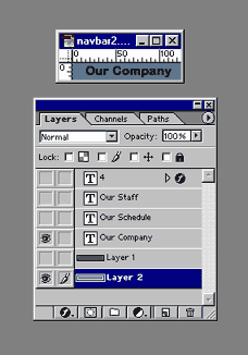
Now go to File>Save for the Web... and then choose
the settings that will give your image the best file
size. Often the color level can be reduced to 16 colors
for navigation buttons, resulting in quick loading buttons.
**Paint Shop Pro: To save the images
it is File>Export>Gif Optimizer
**Fireworks: Click the export icon.
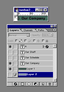
For the second button, just change which layers are visible. The screenshot below now has the green layer, the same "Our Company" text and the Wingding arrow visible. Go to: File>Save for the Web.. and optimize and save the second image.
 Remaining Buttons Remaining Buttons
Follow the same show/hide layers procedure to make all your remaining buttons. Since the text layers were made by duplicating a layer, the text placement should be exact.
One final tip: save your image file as the native
format for your graphics program, which will retain
the layers, so you can easily add more layers if needed
in the future.
Back to the Top
|

